This Chart Shows The Average Wage For Almost Every Job In America
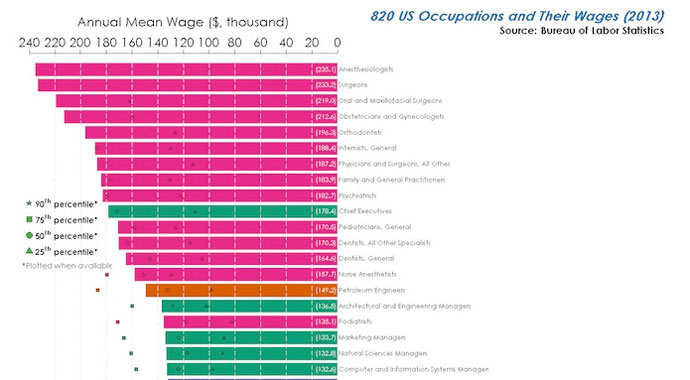
Image via imgur
One guy just laid out the the truth for a lot of people: There’s a huge salary disparity in America.
Reddit user Dan Lin uploaded a comprehensive chart showing nearly every American occupation and its average wage. It uses data from 2013 for 820 occupations U.S. provided by the Bureau of Labor Statistics. The shapes on each bar of the chart indicate the salary range in that field, if available.
The conclusion: Medical professionals, on average, make the most money in the country, with anesthesiologists taking the top tier at $235,100 a year. Surgeons follow closely behind with an average yearly salary of $233,200.
And out of more than 800 occupations, workers in the fast food industry make the least amount of money at only $18,900 a year — an amount that puts many trying to provide for their families under the poverty line. Those in the hospitality industry, including hosts, cashiers and lobby attendants weren’t very far behind, all averaging yearly wages of less than $20,000.
While the ranking of these occupation by their yearly salaries isn’t the most shocking news to break today, it is definitely an eye-opening experience to consider how many people are truly living paycheck-to-paycheck in the land of plenty.

Image via imgur