Yahoo Launches Search Page Redesign… Can You Tell The Difference?

Image via Flickr/ alykat
In case anyone still cares, Yahoo launched its redesigned search page today, and it’s nothing more than a Google wannabe. After months of hype, the redesign, touted as more “modern” and cleaner, adds a navigation bar to the top of the page, much like Google’s design. But other than that, it’s hard to tell the difference. Other changes are reported to speed up the page’s load time. Search results are also apparently placed higher on the page in an attempt to engage more users to stay longer. But again, who can even tell?
The Yahoo Search redesign is the latest change the floundering company has made under CEO Marissa Meyer’s leadership. Earlier this year, Yahoo unveiled its newly-designed home page, which PCMag called an “extremely cluttered interface that befits the need for the cramped ugliness that you find on many Asian sites,” complete with a trending news section that features links that are certainly not trending, but likely paid.
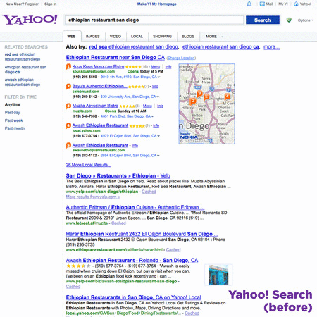
Image via Yahoo/Tumblr
Since Mayer took the reins nearly one year ago, Yahoo has also rolled out updates to its flagship app, mail app and its photo-sharing network Flickr; it also introduced a new weather app. Plus, Yahoo recently acquired Tumblr, a popular social network.
Will the changes be enough to turn around Yahoo? The company may not be in as deep as many believe. It’s home page has never lost its status as a top Internet destination, attracting 392 million visitors in May—a 7 percent increase in traffic from May 2012. The new design is unlikely to make a difference, but Yahoo has also integrated Facebook into its new search design, and users willing to connect the two sites should see more results tied to their Facebook interests.
The new search page is also designed to continuously refresh as a user scrolls down the page—an update that could either prove useful or a huge pain in the ass.